
Fred Duncan Performance Training Website
The challenge for Fred Duncan’s new website was a unique one: combine two separate companies under the umbrella of a new name, new colors, and a new logo. While the design is my own, credit for the build goes to the excellent Kaitlin Bolling.
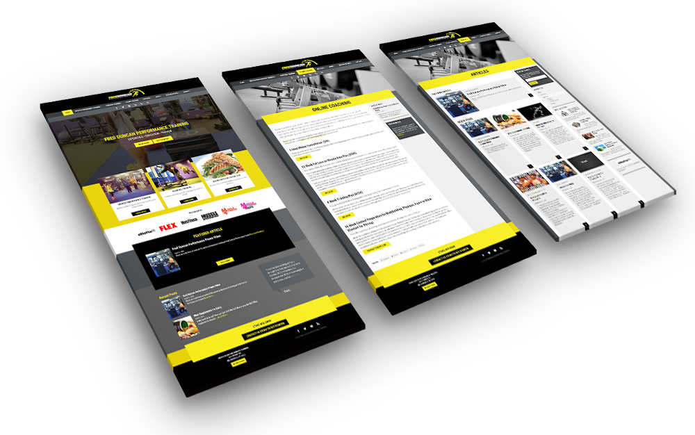
Black and yellow, the colors that Fred chose for his new logo, are vibrant and mostly dark, presenting a challenge for readability but lending themselves well to areas that are mant to draw attention, such as call-to-action areas.
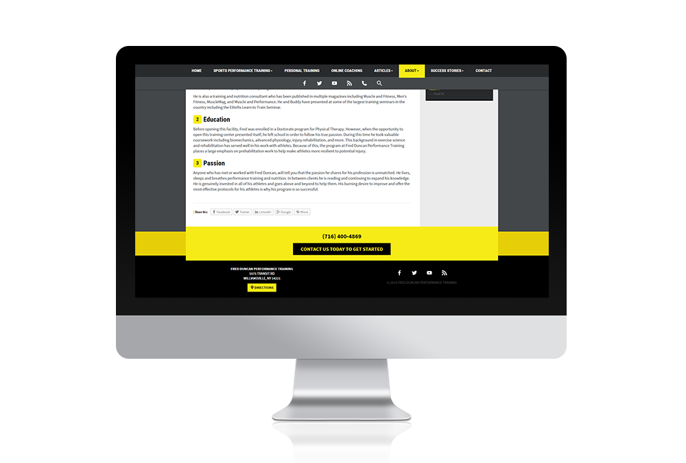
The goal of the website, of course, is to attract customers for Fred’s business. The call to action that sits just above the footer on every page is big, bold, and sure to draw attention. Good use has been made of testimonials and Fred’s extensive collection of articles as proof of his expertise.

Visit Fred’s Website